
Sharlene had a problem with a recent purchase. So, she visited the product’s website. After reading page after page and slogging through Frequently Asked Questions, she still did not have an answer.
Sharlene decided to contact the company directly. And that’s where the trouble really escalated.
Contact Us – If You Can
How many times have you decided to contact a company directly and hit a brick wall? Wouldn’t you think a Contact Us page is the most basic of website requirements?
Then why do so many businesses get it wrong? The following are 5 super-annoying, scream-evoking Contact Us practices that drive site visitors nuts.
Practice #1 – An M.I.A. Contact Us Page
The concept is simple. Add a Contact Us page for site visitors to use. But have you visited a site and searched high and low for a way to contact the company? Only to never find a Contact Us page or it’s so hidden, Sherlock Holmes would fail to find it.
Your Contact information is Missing in Action (M.I.A.).
Simple Fix
Add a Contact Us page to your site with a visible link to its location. Put it at the top navigation. Quit burying it at the bottom of the page – or somewhere even more obscure.
Okay, this may be my personal preference. We all know to scroll down to see Contact Us in the footer (usually). But why not put it above the fold or in the header?
Practice #2 – Limited Access
Many of you know I am a caregiver for my almost 101-year-old mother. Taking care of her needs is always an interesting journey.
Recently, I attempted to contact her administrator who handles pension payments. We had not received a 1099-R statement for tax purposes.
Upon visiting the site (which the company outsourced to another administrator), I encountered the following contact information.
Phone Number
It ran me through the usual phone tree options. I also listened to the typical “we’re experiencing an unusually high volume of calls” excuses. The next thing I know, the call transfers to a survey to rate my customer service experience – without EVER connecting to a customer service representative.
Mailing Address
Oh, how convenient. Give me your P.O. Box address or if I want to overnight my question, a snail mail address.
That’s it!
- A phone number that never connects you to a live person
- And a mail address for super-fast results. *Dripping with sarcasm*
- No Live Chat – or Text – or 21st century connection.
A Contact Us page with more hurdles than help is almost worse than no page at all. Now, you ticked off site visitors even more.
Simple Fix
Offer multiple ways to get in touch. Site visitors have different preferences and skill sets. Not all companies can accommodate a Live Chat but an email or contact form is a low-cost alternative.
Of course, whatever options you offer, responsiveness is a must.
Practice #3 – Crappy Contact Forms
Think about the last time you were forced to use a Contact Form to get in touch. I suspect it wasn’t your preferred method. Okay, it is what it is.
But that doesn’t mean you have to make the form even more painful.
- Asking for unnecessary information that falls under the category of None of your business – or it is so long, users abandon it before they hit Send.
- CAPTCHA you can’t read (especially baby boomer eyes) or whatever security hoops you add.
- No confirmation of a successful transmission to the company or if the form is floating out in cyberspace.
- Limiting choices frustrates the user when none of the reasons for getting in touch fit their problem. That is why God invented “Other” and text to explain.
Simple Fix
Think simple, clear, unique. 😉
- Simple – Studies show conversion rates improved nearly 80% when reducing the number of form fields from 3 to 2 fields.
- Clear – Include well-defined choices with a text option for users to explain. Keep security checks readable and easily understood. Acknowledge the form was sent.
- Unique – Put your own spin on the form. Inject your brand and personality. See examples under #4.
Practice #4 – Cutesy Contact Page Names
I get it. You want to be unique. That’s not a bad thing unless unique means confusing. Put yourself in your site visitor’s shoes. They want to contact you. Period.
Phrases like – Let’s Work Together – or Still Not Sure? do not convey a way to get in touch. You can still put your unique spin on contact forms that are clear to the visitor.
For example, adding reasons for the contact helps direct site visitors to the right help. Below are a few examples of unique contact forms.
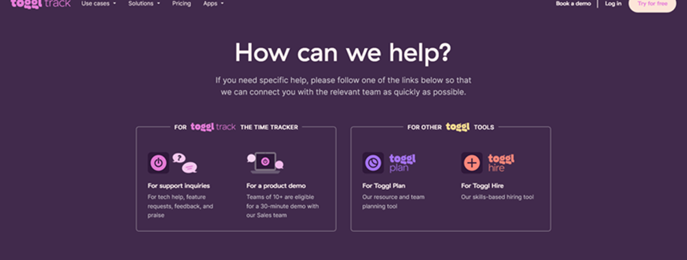
Toggl
This Contact Us page offers help with using the product or for those seeking more information before purchasing (a demo), as well as other tools the company offers.
If you scroll down, it includes Frequently Asked Questions (FAQs) without forcing you to read those first before contacting the company (a personal pet peeve of mine).
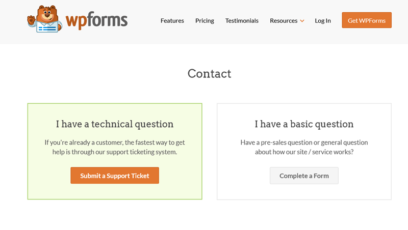
wpforms
I love the simplicity of this. At a glance, the site visitor knows where to click based on the issue.
Practice #5 – Dead Chat
Have you noticed how many sites drive you toward Live Chat with promises that it is the quickest way to resolve problems? I would not mind using it – if that were true. But too many times that is simply not the case.
Live Chats that are more irritating than helpful share the following 3 characteristics.
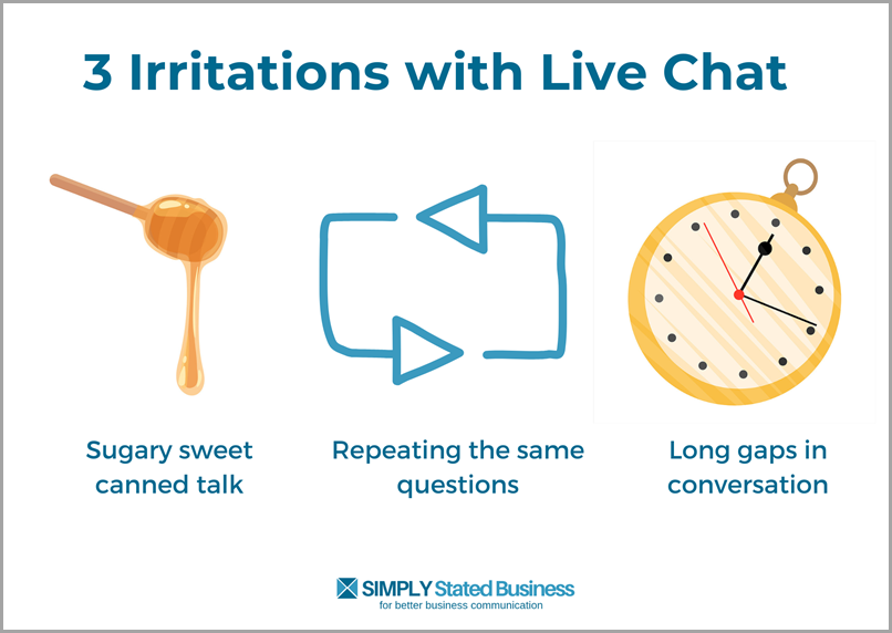
Sugary Sweet Canned Talk
Sound familiar?
- My name is David. It will be my great pleasure to help you today.
- Thank you.
- How are you doing today?
- Fine (picture my angry face)
- How may I help you today?
Repeating the same questions
Bad enough you must wade through the canned discussion. But even more irritating is being asked the same questions you answered at the start of the Chat.
- Your website/account/operating system or whatever they already asked
- A description of your issue – again!
Long gaps in discussion
What really drives me nuts is the loooooog gaps after I hit Submit on my response. More than once I responded with a Hello???
It is obvious that the representative is juggling multiple users at once. Either that or I always hit them when they’ve gone on break.
I take a deep breath when I initiate Live Chat. I know I am probably in for a long exchange with this “quickest way to resolve problems.”
Simple Fix
- Can the canned script.
- Ask questions once.
- Respond to each entry quickly.
Contact High
With all the technology and communication tools we have today, getting in touch should be simple. Unfortunately, too many businesses make that difficult.
By eliminating the above Contact Us irritants, you can bring a human touch back to site visitors.
What annoys you when you need to contact a business? Share your stories in Comments.
Credit: Bigstock Photo
Credit: Canva
=====================
Helping you keep your business communication simple, clear & uniquely yours.
=====================
0 Comments