
Ramon owns a graphic design business. So, he understands how critical his website is to his success. But when site visitors arrive at his Home page, it assaults them with auto-run videos, sliding carousels, and chaos.
Visitors cannot click away fast enough.
Website design is personal. Both to the owner and those who visit. We will never completely agree on what we like and what we don’t. But I’ll share 5 things I HATE on a website if you’ll share yours. Deal?
Website Woes
The best perk about today’s websites are all the tools we have. The worst thing about today’s websites are all the tools we have.
- Ready-made theme templates and designs
- Plugins for better functionality
- Stunning graphics
But if you want an example of different ideas of what are award-winning or best designs, look at Web Site Builder Expert’s top 11 picks for 2023.
I do love the simplicity of its #5 choice, Fat Choy. Alnd although I applaud the creativity of the #10 winner, Bruno Simon, I found the navigation quite confusing. What do you think?
As promised, the following are 5 things I hate about websites. Share your pet peeves in Comments.
#1. Pop-ups
I know, I know. Statistics show pop-up forms work. But to what end?
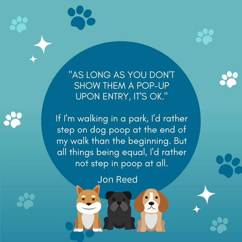
Copywriter and web consultant, Gill Andrews, offers evidence (with data back-up) of why you should ditch pop-up forms. And I LOVE her link to Jon Reed’s argument against pop-ups.
Check out Jon’s response to Argument #2 for using pop-ups.
Do you especially hate those floating pop-ups that stalk you around the site as much as I do? While I will never produce the brilliance of Henneke Duistermaat, I share her opinion (as quoted in Gill’s post) that I want readers to enjoy the experience of visiting my site.
So, your experience is more important to me than adding one or two subscribers. But that’s me. You may have a different view. As I always say:
There is no right or wrong. Just different.
Miller Musings
#2. Snarky Responses to Opt-outs
Now that people smarter than me established no one likes pop-ups, adding snarky responses to their decision to opt-out is even more infuriating. So that’s my number two most hated feature on a website.
The following is a small sample of what those responses look like.
- Jon’s vacation rental site example – No thanks. I already know everything about vacation rental.
- Security plug-in – No, I like being hacked.
- Mattress retailer – No, I hate being comfortable.
If you’re like me, you do not find these snarky responses humorous or clever.
#3. Navigation Nightmares
Picture driving down a freeway (without GPS) and without exit signs. As you fly by, you realize the exit you just passed is yours. Or is it? A poorly designed website is like that freeway with no signs.
Remember the last time a site’s design stopped you dead in your tracks? What did you do? You probably exited the site.
Navigation nightmares steer visitors away from your website. The following are a few examples of detour-causing designs.
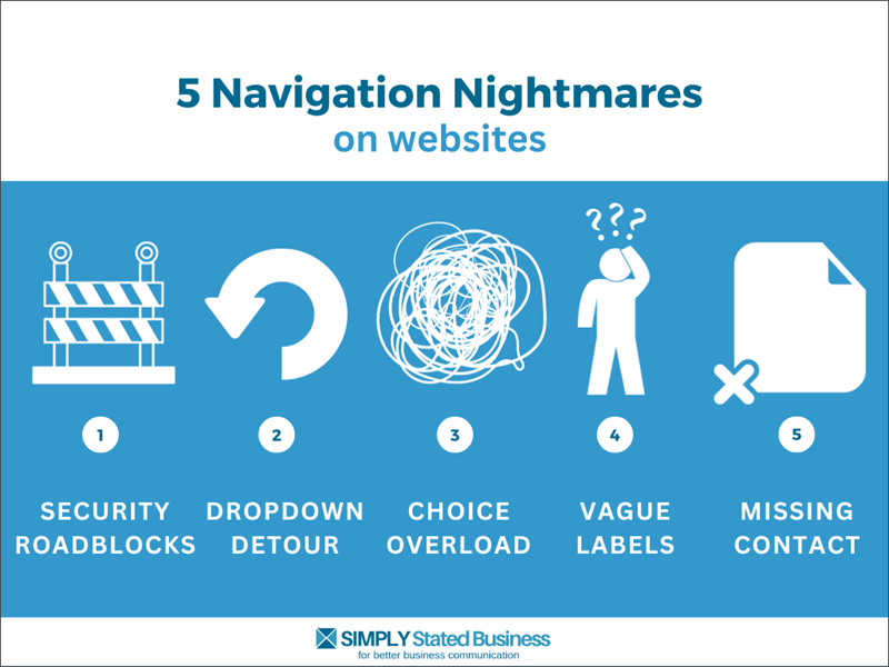
Getting visitors to your site is not easy. Keeping them there is even tougher. So, navigation nightmares like these will not help your marketing efforts.
Security roadblocks
Protecting your site is smart. But making visitors jump through multiple hoops just to view your page will chase off most visitors. Like those hated, impossible-to-read CAPTCHA letters.
Dropdown detours
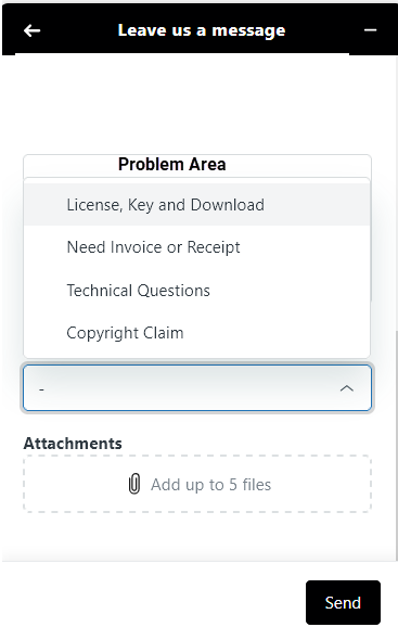
I admit I was guilty of this. This post by Gill Andrews had me rethinking dropdown menus. Must be my day for promoting Gill – and, no, I have no affiliation.
For example, the illustration below shows a dropdown menu for a support ticket. While it does not have a ton of choices (like some do), why do we have to deal with a dropdown?
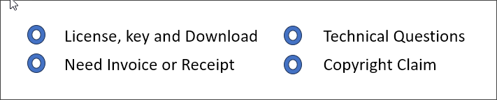
A simpler navigating tool would list choices with a radio button you click on. Below is an illustration of the alternative format.
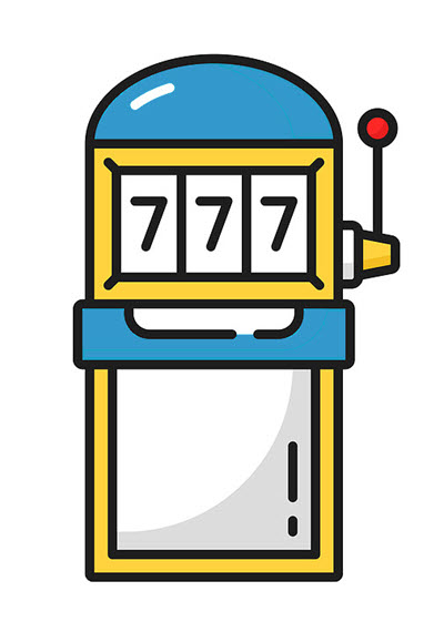
I really hate the dropdown menu where you scroll through the choices to see all the responses. Reminds me of the one-arm bandit.
With the above simple alternative, you have all your choices right there and a single click shares your selection.
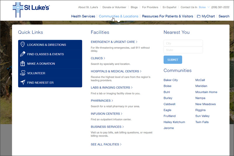
Choice overload
Whether it’s in the dropdown menu or some other design, too many choices test the patience of your site visitors. Don’t be surprised if they fail the test.
Check out the choices when you hover over Communities & Locations (illustrated below). Your eyes don’t know where to go first. Too much STUFF.
Vague labels
Think about the last time you visited an online store for a specific product. Let’s say it’s a sleeper sofa. You go to a national brand that sells every piece of furniture you can think of. At the top of the Home page is the following menu.

Simple, right? Well, not really. Presumably, if you click on Store, you gain access to every type of furniture the company sells. You’re forced to click through more navigation options to get to your sofa sleeper.
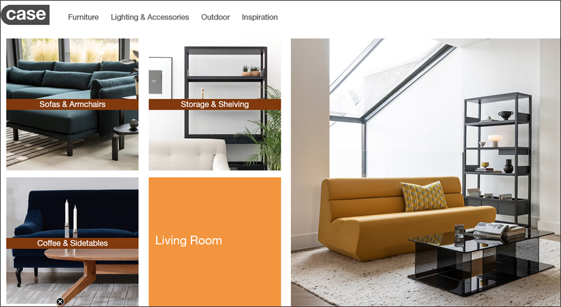
Look at the furniture page for the company, Case Furniture. The simple, slick design offers a single click to view the specific furniture you’re looking for – sofas.
Missing contact
Matthew received his order, but it had missing parts. So, he headed to the company’s website to find contact information. One problem. Matthew could not find a phone number, a contact page, or even a Live Chat option.
Next, he tried Googling the company with the search term, “Contact.” Turns out, the information was on the company website. But it was buried in a place that was not at all clear.
Contact information that is hard to find is as bad as having no information at all. Maybe worse. It certainly raises the blood pressure.
Bonus irritation – I hate companies that force you to a single form of contact. One business I purchased a domain from at the beginning of my freelancing career limited contact to a phone number.
- No email option.
- No Chat alternative.
- No support ticket.
And they outsourced customer service to a vendor that services multiple businesses. Can you spell slow response?
#4. Autoplay Videos
When I originally wrote this post, autoplay videos ranked number one. Fortunately, I do not encounter it as much as I did. However, it still exists on some websites.
You type in the URL and are immediately assaulted with a loud-playing video. A newer twist is the video hops down to a small square in the corner, still playing its content. Stop.
#5. Tiny Print
My last website pet peeve has also improved over the years. And while it is more of a problem for my squinting, baby boomer generation, tiny print is annoying to site visitors.
The reason for the small font may be related to your theme, the font you choose, or is limited to mobile formatting. The good news (for boomers and everyone else) is you have multiple tools to fix it.
- Adjusting font size in your theme’s setup
- The ability to preview text content in desktop, tablet, and mobile view
- A huge selection of fonts that feature easy reading typefaces
Website Nirvana
We are in search of website nirvana. What that is will be different for each of us. For me, my nirvana is: Keep it simple, clear & uniquely yours. 😊
- What would help you reach website nirvana?
- Do you have additional pet peeves that tick you off about the sites you visit?
- Please share your thought in Comments.
Credit: Bigstock Photo
Credit: Canva
=====================
Helping you keep your business communication simple, clear & uniquely yours.
=====================
In 2010, I joined the Ultimate Blog Challenge – blogging every day for 30 days. This post originally published on August 5, 2010. This November 7, 2023 version updates it.
====================
Cathy,
I’m with you all the way! My biggest pet peeve is LOUD videos that begin as soon as you navigate to the page, especially when they start before the rest of the page is loaded and you can’t turn it off until it finishes!
.-= Jen Turi´s last blog ..Human Resources and Healthcare Reform – Resources for HR =-.
Makes you want to strangle it, doesn’t it? 🙂
Thanks for stopping by, Jen.