
Marcus clicked on the instructions to his new WordPress theme. He couldn’t wait to get started.
- His mood rapidly changed.
- As he followed along, Marcus hit spots that the instructions did not cover.
- The guide was so bad he abandoned the theme to look for another.
Has this happened to you?
- Maybe it wasn’t a new WordPress theme.
- It could be a new software program.
- Or something as simple as a new coffeemaker.
Remember that frustration the next time you share a how-to manual or content. Keep it simple, clear, and unique by incorporating 5 steps to better instructions.
Instructions for Life
Don’t you wish we had a user manual for life? Maybe we do but it’s so poorly written that it’s the reason life is so tough.
You are probably sick of hearing it, but keeping it simple, clear, and uniquely yours is a good guide for any scenario – including life. So, study your final product for simple, clear instructions, but don’t be afraid to throw in a bit of you.
Ready to get started on those 5 steps to better instructions?
#1 – Let users know what to expect.
My dad had many southernisms. Being born and raised in the south, he was a walking Rolodex of clever sayings, like this one:
Don’t do what I do. Do what I say.
So, despite being one of those who is guilty of not always following my own tips, let’s just say I am trying to do better.
One method I like to let people know what to expect is the use of a Table of Contents (TOC) for longer posts.
- TOCs offer a snapshot of topics covered.
- Readers can choose what they want to read.
- The TOC helps focus the reader and simplify content.
So, when starting your instructions, don’t forget to do a lead-in. Something that let’s them know what to expect.
- Tell users what’s contained in the instructions.
- Include links to specific topics.
- Let them know where to find help.
#2 – Use logical steps.
Remember Marcus? He tried to follow the guide but discovered that some of the instructions he needed were missing.
Missing steps is one of the prevalent faults of user manuals. Each person has unique experience, ranging from an expert to a beginner. The missing step may be the critical piece the person needs.
For example, Marcus wanted to adjust the spacing in his blog posts and to have it applied by default on all posts. The instructions showed the following.
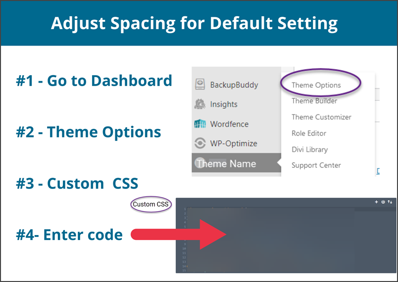
One problem with the above instructions. Marcus did not know CSS code and no sample code was provided (or how to create it).
Of course, not everyone is proficient at creating CSS code (like yours truly). So, the theme developer should offer some options, such as technical support to do it, referrals to those who offer those services, or perhaps plugins that work with the theme.
#3 – Tell users what to do.
What you consider a basic step could be unknown to a user reading your how-to. Instead, you need to be even more basic.
- If users need to hit Enter before moving on, tell them that.
- A Save feature only works if the user knows to use it (unless there’s an auto-save – then tell them it saves every xx minutes).
- Nothing worst than losing all the work you did because you did not hit Save.
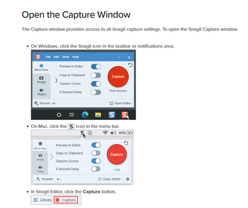
Think about outside factors that could change what users do. Below is a great example. The illustration is a snapshot from TechSmith’s tutorial of its Snagit Capture feature.
Notice how they let Windows versus Mac users know what action they needed to take.
#4 – Give users options for learning.
The great thing about people is we are each unique.
- Some prefer to learn by reading.
- Others want discussions.
- And some need to see and touch for themselves.
With so many learning styles (which scholars argue over the number all the time), users need options. For example, when podcasts first became all the rage, I tried listening. But I found podcasts are not my thing.
Does that make me right and others wrong? Definitely not. My mantra is:
There is no right or wrong. Just different.
Great Philosopher, Cathy Miller
So, provide options for learning.
- Written content satisfies the reader.
- Videos and images appeal to the visual audience.
- Audio recordings appeal to those who prefer listening to instructions.
Offering multiple forms of learning is a bonus for users who want more. I like to watch videos but to try it myself, I need step-by-step written instructions.
#5 – Be visual.
Even if you’re working on the written format, images and screenshots enhance understanding. Techsmith’s illustration shown above is in addition to their video tutorial.
Instructions Learned
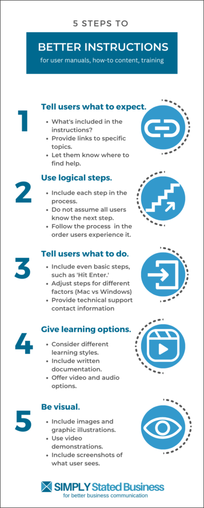
And to prove I practice what I preach (this time), the graphic below summarizes the above 5 points. You can download a PDFversion if you are so inclined.
What tips do you have for better instructions? Do you have your own nightmare stories about user manuals? Share your best stuff in Comments.
==================================
Helping you keep your business communication simple, clear, and uniquely yours.
==================================
Great content and I did enjoy this: “There is no right or wrong. Just different.
Great Philosopher, Cathy Miller”
Thank you kindly, Maryann. I keep it close as a reminder to not get so judgmental. Thanks for the comment and share.