 I bet you know this. You heard or read it a million times.
Slide presentations stuffed with bullet points and text bore the heck out of your audience.
You may have been one of the bored audience members – multiple times.
But how many of you, despite your experience, continue to fill your slides with stuff? And why?
- Because it’s a technical presentation
- Your audience needs that stuff
- You can’t give them slides with a maximum of 6 words
That last point is the crux of the problem.
Stop equating your technical presentation with handouts.
Technically Speaking
Mary represents an employer that offers health benefits. She’s confused by all the health reform legislation flying around. Who isn’t?
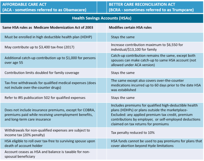
So, Mary decides to attend a conference presentation that promises to explain it all to her. Great! Until Mary sees the following slide.
No matter how pretty the shading or how big the display screen, a slide with this much detail is a death knell for your presentation.
- The above example is one teeny, tiny part of health reform
- Imagine an entire presentation with slides like the one above
Kudos to my reference, the Kaiser Family Foundation, for their updated comparison of proposed health reform policies to our current Affordable Care Act (ACA).
Keeping a technical presentation simple is challenging. But, that does not mean you abandon good presentation tips.
Let’s try a different approach.
Technical Presentation Tips
Do you remember the presentation tip – one idea per slide? When you have a topic as complex as health reform, you may think that’s impossible.
Yes, it is challenging, but try using that tip as your benchmark. I’ll show you how I incorporated one idea with additional tips for simplifying your technical presentation.
Tip #1 – Three-peat your message
While I’d love to take credit for discovering the magic of three, science beat me to it. We remember stuff better when it’s grouped in threes.
Look at the above table comparison. I know. It’s painful.
Try identifying three categories that changed under the Senate bill (BRCA). Okay, you may not find this as interesting as a health care geek like me. Let me give you a hand.
I came up with the following three broad categories.
- Contribution maximum
- Spouse’s catch-up contribution
- Qualified expenses
Now, let’s see how I can use that in our presentation.
- Did you notice there is only one idea per slide?
- The speaker can share more of the details during the presentation and in handouts
- For example, what is the new “nearly double contribution maximum”?
Admittedly, the above presentation is stripped to the bare bones for illustrative purposes. However, by minimizing what’s on the slide, the audience is more likely to remember the three broad categories of change.
- Contributions
- Spouse’s catch-up contributions
- Qualified expenses
Bonus Tip: Repeating your 3 categories reinforces memory.
Tip #2 – Tell a story
Have you noticed that businesses tend to think certain techniques do not apply to technical presentations? How do you tell a story about techie stuff?
Telling a story makes your message real. The technique helps your audience relate to your topic.
Remember Mary looking for help understanding health reform? There are plenty of Marys in that conference audience. Use her story to tell yours.
I used animation for purposes of this post. Hopefully, you’re animated enough for your audience.
Don’t you hate it when the presentation is livelier than the presenter? Don’t be that presenter.
Tip #3 – Share useful hand-outs
What’s one of the first requests webinar or conference audience members make? They ask for a copy of your presentation, right?
Delivering handouts is smart strategy, especially for a technical presentation.
- Handouts help you simplify your presentation
- Audience members can relax, knowing the details go home with them
- That means they are more likely to listen to what you have to say
And isn’t that what you hope happens? But, don’t take the lazy way out and deliver a copy of your presentation as your handout.
If your handout is a copy of your presentation, congratulations! You bored your audience to death. Share on XHowever, even if you mesmerized your audience, can you picture the anarchy if you give them copies of your “one idea per slide” presentation?
Bullet-proof your technical presentation against boredom with customized handouts. Share on XGive thought to your handouts.
- Create a separate handout for your technical presentation
- Let audience members know at the start you have customized handouts
- Then impress them with your stellar presentation
Consider what handouts work best for your topic and audience. Using the health reform topic, the following are a few possible options.
- The table comparison illustrated above
- A timeline of critical milestones
- Resources for more information (industry websites, ebooks, reports, etc.)
- A copy of your company’s illustrated report or short ebook
- Contact information for additional questions
Presentation consultant, Lea Pica, offers a PowerPoint Template and other good handout ideas in her post, How I Quickly Create Effective Presentation Handouts.
Handouts are a bonus to a great presentation. They are also the perfect opportunity for you to gain more visibility for your business.
Technical but Not Boring
Presenting technical information is labor-intensive. So, why am I creating more work for you by suggesting you have separate handouts?
Because simple works. When you simplify learning, you keep clients happy and open the door to more prospects.
- Use the magic memory of three
- Tell a story audiences relate to
- Share your knowledge
This quote Lea Pica shared in her post sums it up nicely.
The audience will either read your slides or listen to you. They will not do both. So ask yourself this: is it more effective if they listen, or more effective if they read?
~ Nancy Duarte, communication expert, author, speaker, and Principal at Duarte, Inc.
What’s your take on technical presentations? Share your thoughts in Comments.
====================
Helping you Keep it simple, clear & uniquely yours – contact me for help with your business writing needs.
=====================


Great info, Cathy. Did you create the animation? I like it.
Thanks, Marcie. Yes, I did. I have been playing around with short videos. I looked at quite a few and, so far, I find RawShorts the easiest to use. Thanks for stopping by (and the share), Marcie. I do appreciate it. 🙂
Love it, Cathy. I remember when I had to present a very tech something or other using someone else’s slides… it was awful. Just like your worst example here.
Thanks, Anne. I think we’ve all suffered through the worst example a time or two. 😉