 Do you remember the story of Mary Decker?
Some of you are probably too young to have seen her story live. Okay, maybe many of you.
Mary Decker was an elite middle-distance runner. She won World Championship gold medals, and many expected her to win another in the 1984 Olympics.
Great Britain’s Zola Budd and Mary were running side-by-side in the 3,000-meter race when they collided, sending Mary tumbling to the ground. She was unable to finish the race – devastating for both runners.
Even the best companies have business communication stumbles. The challenge is picking yourself up and getting back into the race.
How Business Communication Stumbles Start
Stumbling on a world stage may be an individual’s worst nightmare. Despite feeling overwhelmed by her public crash, Mary Decker did run other races. She later said her inexperience of “running in a pack” contributed to her fall.
Identifying the source of the stumble is the first step in avoiding a repeat performance.
 Some stumbles are worse than others. One disastrous example is the confusion and misinformation regarding the Coronavirus (COVID-19). Hopefully, your business communication stumbles will not have such devastating results. This post tackles the less catastrophic missteps.
The post, Are You in a Bad Words Relationship, identified four factors that contribute to business communication stumbles.
- Fails to grab attention
- The format and/or design detracts
- Your message is not clear
- There’s nothing unique about the content
The following examines each factor, sharing examples, fixes, and resources.
 1. Fails to Grab Attention
Technology and social media kicked businesses into an epic battle for attention. Business communication is:
- delivered faster
- in multiple forms
- and higher volumes
Your audience is bombarded by marketing messages. Fail to grab their attention, and your content will not be read – no matter how brilliant it is. Our shrinking attention spans only compound the problem.
Examples
Imagine the following banner pops up on the webpage you’re reading.
Health Insurance Quotes
A frightening outcome from the Coronavirus is the loss of health insurance. Right when it’s needed most. Because most employees have coverage through their employer, the loss of their job meant the loss of their health insurance, too.
So, the topic is very relevant, but the bland headline offers little incentive to click and learn more.
How to Fix it
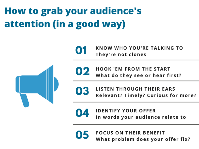
The illustration below shares ideas for creating attention-grabbing genius.
So, let’s see how we can make that boring pop-up ad more enticing.
- Why not target the people who lost their insurance due to this lousy pandemic?
- How do you hook ’em? Speak to their need – their recent loss of insurance.
- That’s both relevant and timely.
- Identify what you can offer that may help.
- Explain how your product or service helps their current situation.
Lost your health insurance due to COVID-19? You have options and we can help.
Although the revised headline does not provide specific answers, it does offer something important – hope.
- Employees who lost their jobs and insurance are scared
- Many are unaware they have options – or what those are
- Your offer of help is the first step to solving their problem
Of course, you need to deliver on that promise once they click on your headline.
Resources
The following are a few of my favorites of the gazillion posts about creating attention-grabbing openings.
- The No-Nonsense Guide to Writing Online Headlines and Subheads – Henneke Duistermaat’s Enchanting Marketing blog shares writing tips, chock-full of examples you will love.
- How to Write Email Subject Lines That Will Increase Your Open Rate By 203% – Neil Patel offers much more than ideas on email subject lines in this popular post.
- 7 Memorable Ways to Open a Speech or Presentation – YPO, a leadership organization for chief executives, provides seven tips for perfecting your opening remarks.
 2. Format and Design Detracts
Are you attracted to all things new? Do you stand in line for the latest idea, product, or marketing tool? You may have shiny object syndrome (SOS).
SOS is distracting to you and your audience. See if any of the following strike a nerve with you.
- The overuse of pop-up ads infuriates most readers – for some, one pop-up is one too many
- Clever rejections on sign-up forms annoy (at least they do for me) – For example: No thanks. I am happy being ignorant
- Slow-loading videos or webpages lead to abandonment issues (when readers click and run)
Difficult-to-read formats like teeny, tiny font size, non-mobile-compatible content, or volumes of text also detract from your message.
Example
 Is there anything more annoying than those lists where you continuously click to the next item? You know why they’re designed that way – more ad revenue from the pop-ups on every page. *SCREAM*
How to Fix it
How can you fix the distractions? First, discover what those distractions are.
Take your content for a runway walk before format and design critics.
Your customers or potential customers are some of your best critics. Their actions (or inaction) speak volumes.
- What are your most shared business communication?
- Which received the most views/open rates?
- What feedback have you received?
Edit for designs and formats that enhance. Nip and tuck elements that detract. This Invision app post offers suggestions for improving your format and design.
 3. Message is Not Clear
Have you ever seen an ad that left you scratching your head?
- You wonder what a company’s product has to do with the ad’s message
- Sometimes you wonder what the heck the product is
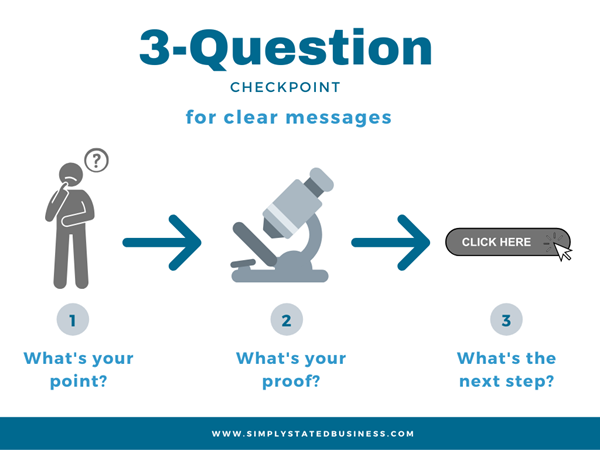
To get your communication vehicle rolling, run the following 3-question checkpoint.
If you cannot easily identify the answers after reviewing your business communication – edit, edit, edit. The SlideShare presentation shown below offers examples.
Resources
The following are a few resources for improving the clarity of your message.
- SlideShare presentation – 3 Business Writing Tips for Trimming the Fat
- Purdue Online Writing Lab (OWL) – Improving Sentence Clarity
- Business writing blog post – Don’t Get Lost in Long Sentences!
 4. There’s Nothing Unique About the Content
Have we run out of ideas? How often have you had this thought? You start to read a business blog or webinar invitation and think ~
- This subject is SO overdone
- Someone else did it better
- There’s nothing new about this
Conveying what is different about your communication in an avalanche of content is one of your biggest challenges. However, I guarantee you are unique.
How to Fix it
Capitalize on what’s unique about your business.
- Spotlight those unique traits in your communication
- Then answer your audience’s question of, Why should I care?
Another great approach is Henneke’s So What test. Convert what you see as unique to a validation of a benefit to your customer (as illustrated in her example below).
“Our doors have strong hinges. So what? They won’t bend when the door is slammed shut a thousand times.” Enchanting Marketing blog
Fixing Business Communication Stumbles
Like elite athletes, dedicated practice raises your performance level to the best you can be.
You win by wearing the shoes of your customers.
- Grab their attention.
- Entice them to stay focused on your message.
- Prove to them the clear advantage of doing business with you.
Keep business communication simple, clear, and uniquely yours.
This is an update on April 23, 2020 of a post published on May 30, 2017. Few of us will forget the start of 2020 when our world was turned upside down due to COVID-19.
#BeSmartBeKindBeSafe
=====================
Helping you Keep it simple, clear & uniquely yours
====================


Great post-Cathy! Filled with helpful suggestions on how to create
relevant posts your readers will appreciate and read.
(pressed Enter before I was finished typing :))
With a nice comment like that, Marie, it is worth repeating. 😉 Thank you so much for the kind words.
Oh boy, Cathy, I wish every company that I deal with would read this and follow your excellent suggestions… I think I’ll forward this to my isp for example.
Thank you kindly, Anne. Share away. 😉
Great concepts to incorporate BEFORE that communication leaves the transom!
Thank you and agree, Roy. 😉
I’d almost forgotten the Mary Decker- Zola Budd story until I saw your post today, Cathy. That really was a long time ago!
Writing blog posts with valuable content is never a problem for me, but making sure the right reader finds it and benefits from the content is. You wouldn’t believe how much time I spend on finding the right introduction, images and checking to make sure my post will convey my message to the reader.
Vatsala, so nice to see you here again. What can I say, I’m old! 😀 Ah yes, the challenge of getting people to actually find and read your content. At least you put in the effort, Vatsaula. That puts you a step above a lot of people.
Thank you for dropping by and sharing your thoughts.
Great post Cathy, bad words are just like curse words. Most people hate those unattractive words. It really doesn’t take much effort to think and use good words. I really like the resources listed in your article. Thank you for your insight and wisdom.
Thanks, Michael. Curse words are a whole other topic. 😀 I am glad you found the resources helpful. Thanks for sharing your thoughts.
Glad to see your advice is still spot-on!
Thank you kindly, Roy. Glad to see you here again. Miss seeing your take on things. 🙂 Stay safe.